Many of us create some kind of black and white mask on top, but that still has a tremendous amount of tonal variation, as well as detail that can make it hard to see what you are really working with.
Here's how I cope with this situation:
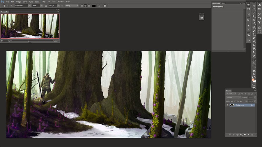
Here's an image I've loaded up in photoshop. The first thing I do is create an empty folder in the layers palette above the image.

From there, we are going to create 2 adjustment layers inside the folder. If you haven't created adjustment layers before, it's the icon in your layers palette that looks like a circle cut into a light side and a dark side.

The first adjustment layer is a "Black and White" layer. I just use the defaults. This has given us that value-range version of our painting, but we're not done.

Now, create a "Posterize" layer, and change the value to '3'. That's it! You now have a 3 tone simplification of your painting. Best of all, the posterize layer simplifies a lot of detail, so you're back to seeing things as shapes instead of details.
Because you put these two layers inside a folder, you can turn on and off the folder at any time to get a perfect view as to how the lights, mids and darks of your painting are working together.
I hope you find this useful, I would love to hear if it helped!
No comments:
Post a Comment